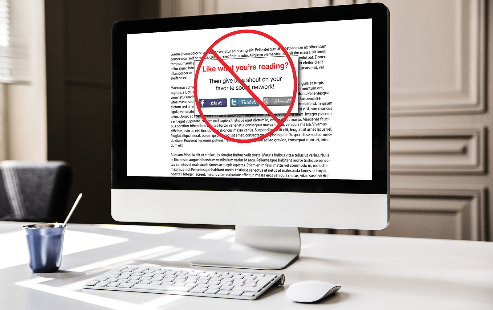
I should begin by divulging that I don’t hate all buttons, only buttons that detract and interfere with a page. For example, floating buttons, especially those vertical buttons attached to the left side of a website. You know…the ones that interfere with copy forcing you to look over, under, and around them to view the information. In 2012 paper.li Blog stated, “The floating vertical bar is quite popular nowadays.” Please stop using it or learn how to use it without covering part of the page. Floating buttons hovering over vital information chase visitors away.
Bloggers want Buttons!
As a blogger, I want buttons. I want them on the website, blogs, eBooks, and videos. I want buttons to share, follow, and like. Give me big brassy, bold, bad, buttons to grab visitor’s attention. Yes sir! That’s what I want. I want buttons to take visitors away from our website. Wait—what? Given control, I’m certain I’d overuse buttons and forget the purpose of the website—to begin the lead generation process. The website is the top of the funnel. It’s hard to fill the top of the funnel when visitors are sent away chasing a button.
Buttons can be Harmful
Buttons can damage a website, destroy a design, and interfere with navigation. Buttons shouldn’t take precedence over typography, layout, or calls to action. Buttons should be secondary. They may not be as important as many believe. For example, how many of you reading this has ever gone to a website specifically searching for buttons? When buttons are given priority over other website functions, they hinder the sites effectiveness. Buttons can impact validation, speed, and security. For example, using a third party widget to create a button could slow a website substantially, let alone create a potential security risk.
Time is Precious
A website only has seconds to capture a visitor’s attention, and buttons are often a waste of those precious seconds. I’m not suggesting to eliminate buttons from websites (can we outlaw floating buttons?) what I’m suggesting is buttons should fit the site not interfere with it. Buttons should add to the site not detract from it. Buttons should match the site not clash with it. Ghost buttons are an example of fitting buttons to the needs of a website. Yes, buttons can be useful, and they’re important. They’re just not the most important thing on a site and shouldn’t be put in that position. If you’d like to talk more about website design and effective use of buttons give us a shout. All you have to do is hit this button.


Leave A Comment