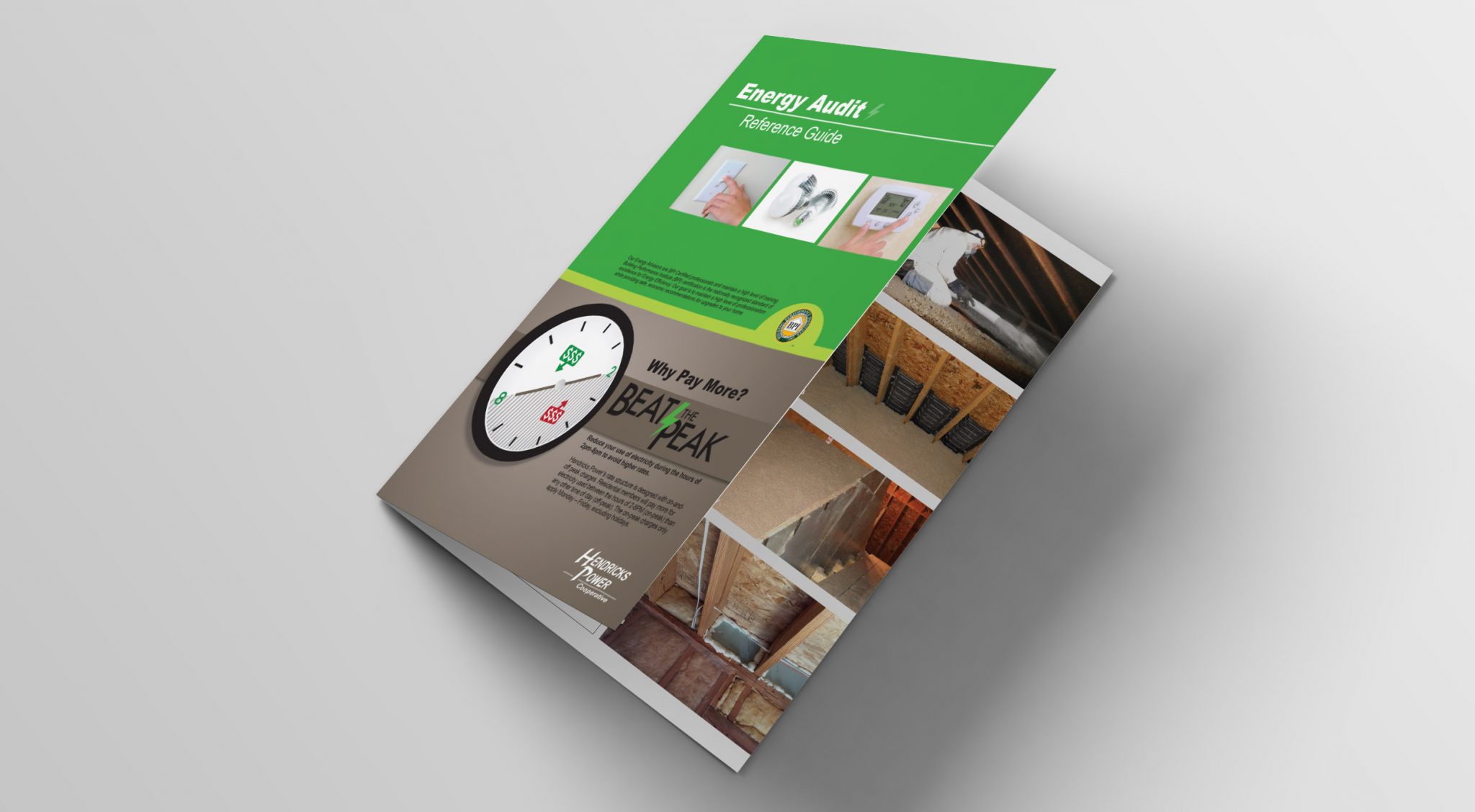
Businesses use printed flyers as handouts at trade shows and events. Sales people use flyers to highlight products during a sales presentation or while canvassing for new business. Electronic brochures are used in newsletters, emails, and shared on websites. There are several factors to a successful flyer, and one of them is the copy. The quality of writing has a lot to do with the success, or failure, of any flyer.
8 keys to creating quality flyer copy
- Headlines can make or break a flyer. How many times have you scanned a headline, not found anything of interest and moved on? Conversely has a headline enticed you to read further? Here are a few examples.
- Keep it simple – For example, “FREE Copy”
- Share news – “Scientist Develops New Weight Loss Program”
- State the benefit – “Save time and money—NOW”
- Explain how to – “How to Save Energy at Home and Work”
- Use proper grammar. No misspelled words, proper use of punctuation, and good sentence structure are important. One of the keys to good grammar is editing. Everyone makes mistakes—the important thing is to find them before others do. Ask someone to proofread the work and if no one is available, you may consider using software such as Grammarly.
- Stay away from text talk and slang. A business flyer is probably not the place to use text abbreviations. U no w@ I mean? Using slang may work for reaching some demographics but in most cases a flyer should be more professional than a text.
- Keep it short. A flyer isn’t the place to wax poetic. There isn’t a lot of space, and furthermore, a long winded lecture may lose readers. Get to the point as quickly as possible.
- Use small words. Multi-syllable words are more often confusing than impressive, and they can break the flow. Always use the simplest word. For example, instead of utilize use…use. And stay away from insider jargon, the only person it will impress is you. If your six-year-old son or daughter can understand it, you’ve done your job.
- Share the FAB (feature advantage benefit). Place emphasis on the benefit. Readers aren’t as interested in what something is or how it works as much as what it does for them.
- Add a CTA (call to action) Ask readers to take action. Here are a few examples.
- Limited offer
- BOGO (buy one get one)
- Added merchandise with purchase
- Free
- Discounts
- Call today
- Sign up
- Tell your friends
- Don’t forget contact information. Contact information including address, phone, email, and web address should be easy to find. Traditionally this information is placed at the bottom of the flyer, but regardless of where it’s placed, it should stand out.
Are you ready to write right?
Flyer copy shouldn’t be complicated. Keeping it on point, with simple language and good grammar, while sharing the benefits and announcing a call to action will capture reader’s attention. If writing copy for flyers doesn’t sound like your thing let us know, we’ll help you create a flyer that soars.


Leave A Comment